Dust-DN Trainning School | Cyprus, 25th April 2026

Case study: Dust intrusion - March 2026
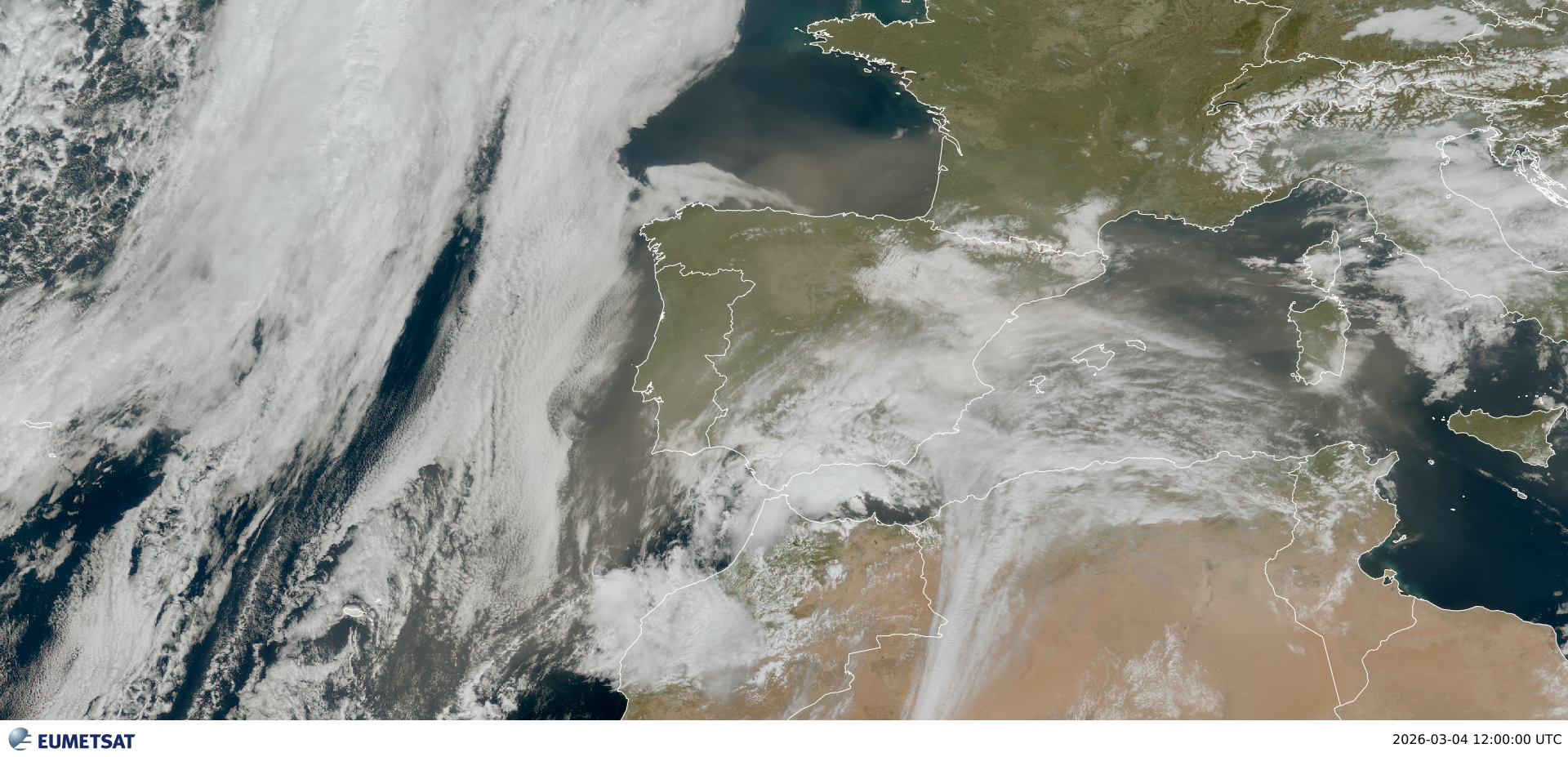
The figure above, that corresponds to True Colour RGB - Meteosat Third Generation (MTG) - 0 degree, was obtained using the EUMETView from EUMETSAT user portal. The image is in 1 km spatial resolution.
In this practical we’ll see how to analyse a dust event using python as a tool to read and visualize the data.
In this notebook, we’ll use data from from ground-based aerosol observation networks that provide information on aerosol properties in a specific site and data from satellite measurements for a spatial overview of the event.
Load required libraries
Python libraries required by the different sections below.
# Uncomment if running on Colab
##!pip install cartopy
# Uncomment if running on CoLab
##import pathlib
##from pathlib import Path
##import gdown
##DATA_LINK = "1qtx6C9wQVeIpKDTbR_aUgesd6ZMQ52Os"
##CREATE_BASE = pathlib.Path("./sample_data")
##CREATE_BASE.mkdir(parents=True, exist_ok=True)
##gdown.download(id=DATA_LINK, output=str(CREATE_BASE / "agora_db.tar.gz"), quiet=False)# Uncomment if running on CoLab
##!gunzip -f ./sample_data/agora_db.tar.gz
##!tar -xvf ./sample_data/agora_db.tarimport pandas as pd
import matplotlib.pyplot as plt
import xarray as xray
from matplotlib import dates
import cartopy.crs as ccrs
from cartopy.mpl.gridliner import LONGITUDE_FORMATTER, LATITUDE_FORMATTER
import matplotlib.ticker as mticker
Part 1 - Ground-based data
In this section we’ll use AERONET data to inspect the dust in the atmospheric column and EARLINET data to analyse the vertical distribution of aerosols.
Python libraries used:
pandas
xarray
matplolib
1.1 - AERONET data
The AERONET (AErosol RObotic NETwork), stablished in 1993, is a global ground-based network of photometers for aerosol remote sensing. It provides long-term and continuos data of aerosol optical, microphysical and radiative properties. These data are accessible for public domain.
AERONET provides globally distributed observations of:
Spectral aerosol optical depth (AOD) at several wavelenghts, from ultra-violet to near-infrared.
Angström Exponent (AE)
Inversion products (e.g., particle size distribuiton, single scattering albedo and assymetry parameter)
Precipitable water vapour
Version 3 AOD data are computed for three data quality levels:
Level 1.0 (unscreened)
Level 1.5 (cloud-screened and quality-controlled)
Level 2.0 (quality-assured).
Here we’ll use Level 1.5 data of Évora site that is integrated in the AERONET since 2003.
Read AERONET data
Lets start with the downloaded .lev15 file of all AOD, AE and precipitable water measurements taken in Évora during March 2026. To read the .lev15 files, we can use the function read_csv from the Python library pandas that returns a dataframe (2D labeled data structure with columns that can hold different types of data).
Before we read the .lev15 file, we can inspect its contents simply by open it (e.g. with Notepad++). We can verify that the first 6 lines contain information we do not need in the dataframe and that missing values are filled with -999.0. For these reasons, we set additonal keyword arguments that allow us to specify the rows of interest and replace -999.0 by NaN.
df = pd.read_csv('data/aeronet/solar/20260301_20260331_Evora.lev15', sep=',', skiprows=6, na_values=-999)

# keyword arguments:
# sep       - specify the delimiter in the file
# skiprows  - lines to skip at the start of the file
# na_values - to interpret the missing values (-999.0) as NaN; replace -999.0 by NaN facilitate the plotting process

df # to show the content of dfAs we can see above, the dataframe contains 431 rows per 113 columns. To check what each column represents, we can print a list of all columns headers. After we check the data types of each column.
# As we can see above, the two first columns, Date(dd:mm:yyyy) and Time(hh:mm:ss), are dtype Object (O).
# Let's create a new column with time in format datetime by using the funtion to_datetime.
# This facilitates the filtering by time and plotting

df['time'] = pd.to_datetime(df['Date(dd:mm:yyyy)'] + ' ' + df['Time(hh:mm:ss)'], format = '%d:%m:%Y %H:%M:%S')

# Set the df index using the time column.
df= df.set_index('time')
df

# To go back to the original dataframe: df.reset_index(drop=True, inplace=True)
/var/folders/7q/czgy7g_j3fb7jw3256f37wrw0000gq/T/ipykernel_78523/1793682009.py:5: PerformanceWarning: DataFrame is highly fragmented. This is usually the result of calling `frame.insert` many times, which has poor performance. Consider joining all columns at once using pd.concat(axis=1) instead. To get a de-fragmented frame, use `newframe = frame.copy()`
df['time'] = pd.to_datetime(df['Date(dd:mm:yyyy)'] + ' ' + df['Time(hh:mm:ss)'], format = '%d:%m:%Y %H:%M:%S')
Visualize AOD measured at Évora in March 2026
Now let’s visualize all points of AOD measured in Évora during March 2026. We can check in the previous steps, the wavelengths for which we have AOD measurements: 340, 380, 440, 500, 675, 870, 1020, 1064 nm.
We’ll use the matplotlib library for plotting the data.
# Create a matplotlib figure
fig, ax = plt.subplots(figsize=(8,4), layout='constrained')
ax.plot(df['AOD_440nm'], 'o--b', linewidth=1, markersize=5, label='AOD_440nm')
ax.plot(df['AOD_870nm'], 'o--g', linewidth=1, markersize=5, label='AOD_870nm')
ax.plot(df['AOD_1640nm'], 'o--r', linewidth=1, markersize=5, label='AOD_1640nm')

# Add axes labels and title
ax.set_title('Aerosol Optical Depth from AERONET in Évora, March 2026', fontsize=14)
ax.set_ylabel('Aerosol Optical Depth',fontsize=14)
#ax.set_xlabel('Time',fontsize=12)

# Add legend
ax.legend(fontsize=12, loc="best", edgecolor='k');

# y-axis limits
ax.set_ylim(ymin=0, ymax=2)

# Add grid
ax.grid(linestyle='--')

# Format ticks
#ax.xaxis.set_tick_params(labelsize=12)
#ax.yaxis.set_tick_params(labelsize=12)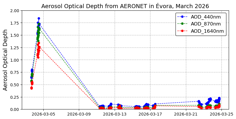
As we can see above, the AOD increases in 3 and 4 of March when it reaches maximum values revealing an increase of aerosols in the atmospheric column. After these days, there is a period of 7 days without AOD values because of the occurrence of clouds and precipitation. After this period, the registred AOD values are very low as a result of a clean atmosphere.
Following the same procedure as previously, let’s take a look to the Angström Exponent variation to check if it assumes low values typical of the presence of coarse particles in the atmospheric column.
# Create a matplotlib figure
fig, ax = plt.subplots(figsize=(8,4), layout='constrained')
ax.plot(df['440-870_Angstrom_Exponent'], 'o--k', linewidth=1, markersize=5)

# Add axes labels and title
ax.set_title('Angström Exponent from AERONET in Évora, March 2026', fontsize=14)
ax.set_ylabel('Angström Exponent: 440-870nm',fontsize=14)
#ax.set_xlabel('Time',fontsize=12)

# y-axis limits
ax.set_ylim(ymin=0, ymax=2)

# Add grid
ax.grid(linestyle='--')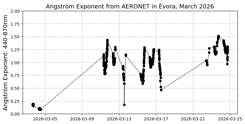
Some statistical parameters using the function describe of pandas library.
Now, let’s focus our analysis in the days with dust. In the next step, we’ll select the days 3 and 4 of March from our dataframe (data from solar photometry) and we’ll add data from lunar fotometry (nights: 3-4 and 4-5 of March), also avaiable at the AERONET site, to plot the AOD and AE and to inspect their evolution.
Data from lunar fotometry are only obtained for certain lunar conditions, and in this event it was possible to colect data from lunar fotometry at Évora site.
#Here we follow the same procedure as before to open the data file and we change date and time to format datetime
df_lunar = pd.read_csv('data/aeronet/lunar/20260301_20260331_Evora.lev15', sep=',', skiprows=6, na_values=-999.0)

df_lunar['datetime'] = pd.to_datetime(df_lunar['Date(dd:mm:yyyy)'] + ' ' + df_lunar['Time(hh:mm:ss)'], format = '%d:%m:%Y %H:%M:%S')
df_lunar = df_lunar.set_index('datetime')

df_lunar
/var/folders/7q/czgy7g_j3fb7jw3256f37wrw0000gq/T/ipykernel_78523/2868593346.py:4: PerformanceWarning: DataFrame is highly fragmented. This is usually the result of calling `frame.insert` many times, which has poor performance. Consider joining all columns at once using pd.concat(axis=1) instead. To get a de-fragmented frame, use `newframe = frame.copy()`
df_lunar['datetime'] = pd.to_datetime(df_lunar['Date(dd:mm:yyyy)'] + ' ' + df_lunar['Time(hh:mm:ss)'], format = '%d:%m:%Y %H:%M:%S')
#
df2  = pd.concat([df,df_lunar]).sort_index()
df2#Select and visualize AOD and AE for the days with dust
fig, ax = plt.subplots(figsize=(8,4), layout='constrained')
ax.plot(df2.loc['2026-03-03':'2026-03-05', 'AOD_440nm'], 'o--b', linewidth=1, markersize=5, label='AOD_440nm')
ax.plot(df2.loc['2026-03-03':'2026-03-05', 'AOD_870nm'], 'o--g', linewidth=1, markersize=5, label='AOD_870nm')
ax.plot(df2.loc['2026-03-03':'2026-03-05', 'AOD_1640nm'], 'o--r', linewidth=1, markersize=5, label='AOD_1640nm')
# Add axes labels and title
ax.set_title('AOD and AE from AERONET in Évora, March 2026', fontsize=14)
ax.set_ylabel('Aerosol Optical Depth',fontsize=14)
# y-axis limit
ax.set_ylim(ymin=0, ymax=2)
#Format time axis
ax.xaxis.set_major_locator(dates.DayLocator(interval=1))
ax.xaxis.set_major_formatter(dates.DateFormatter('%d-%b'))
ax.xaxis.set_minor_locator(dates.HourLocator(interval=3))
ax.xaxis.set_minor_formatter(dates.DateFormatter('%H:%M'))
ax.tick_params(axis='x', which='major', rotation=30)
ax.tick_params(axis='x', which='minor', rotation=30)
#Define a second (right) axis for AE
ax2 = ax.twinx() # instantiate a second y-axis that shares the same x-axis as AOD
ax2.plot(df2.loc['2026-03-03':'2026-03-05', '440-870_Angstrom_Exponent'], 'o--k',
linewidth=1, markersize=5, label='AE_440-870nm')
# Add y-axis label
ax2.set_ylabel('Angström Exponent', fontsize=14)
# y-axis limit
ax2.set_ylim(ymin=0.06, ymax=0.2)
# Add legend
# ask matplotlib for the plotted objects and their labels
lines, labels = ax.get_legend_handles_labels()
lines2, labels2 = ax2.get_legend_handles_labels()
ax2.legend(lines + lines2, labels + labels2, loc='best')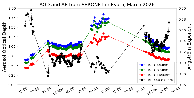
1.2 - European Aerosol Research Lidar Network (EARLINET) - Vertical profiles
The European Aerosol Research Lidar Network, EARLINET, was established in 2000. Since then EARLINET has continued to provide the most extensive collection of ground-based lidar data for the aerosol vertical distribution over Europe (see here the sites distribution).
EARLINET provides Long-term multiwavelength backscatter and extinction coefficient profiles in netCDF files that can be accessed via the EARLINET Database.
Data are three quality levels:
Level 1: Basic quality control
Level 2: Advanced quality control
Level 3: Climatological aggregated products
Here, we are using level 1 data.
Open and inspect the content of EARLINET .nc files
The files to be open correspond to the aerosol backscatter coefficient at 1064nm measured with PollyXT on 4 of March in Évora site.
To open the files and inspect its content we’ll use the Python library xarray.
#The function open_mfdataset, from the library xarray, allows to open multiple files as a single dataset.
#Earlinet files are 30-minutes files.

file_dir = 'data/earlinet/backscatter/'
earlinet = xray.open_mfdataset(file_dir+'*.nc', combine="by_coords")
earlinet

#Below we can inspect the struture of our dataset.
#The dataset has dimensions (wavelength=1 (1064nm), time=37 (sets of 30 min), altitude = 153 (vertical levels of ~ 60 m)).
/var/folders/7q/czgy7g_j3fb7jw3256f37wrw0000gq/T/ipykernel_78523/3189997459.py:5: FutureWarning: In a future version of xarray the default value for join will change from join='outer' to join='exact'. This change will result in the following ValueError: cannot be aligned with join='exact' because index/labels/sizes are not equal along these coordinates (dimensions): 'altitude' ('altitude',) The recommendation is to set join explicitly for this case.
earlinet = xray.open_mfdataset(file_dir+'*.nc', combine="by_coords")
/var/folders/7q/czgy7g_j3fb7jw3256f37wrw0000gq/T/ipykernel_78523/3189997459.py:5: FutureWarning: In a future version of xarray the default value for data_vars will change from data_vars='all' to data_vars=None. This is likely to lead to different results when multiple datasets have matching variables with overlapping values. To opt in to new defaults and get rid of these warnings now use `set_options(use_new_combine_kwarg_defaults=True) or set data_vars explicitly.
earlinet = xray.open_mfdataset(file_dir+'*.nc', combine="by_coords")
#Add backscatter values to an array (DataArray)
bcks = earlinet['backscatter'][0,:,:]
bcks#Since we are working with level 1 dataVisualize the evolution of the aerosol backscatter coefficient
Below, we plot the Aerosol backscatter coefficient for Évora on 4 of March 2026, the day of maximum AOD.
# We want to represent time in x-axis and altitude in y-axis.Therefore, we need to compute the transpose of backscatter.
# The units of backscatter are m^-1.sr^-1. If you want convert it to Mm^-1-sr^-1 multipling bcks1064 by 1e6.

#Alternative and fast way to visualize backscatter: bcks.transpose().plot()

# Create a matplotlib figure
fig, ax = plt.subplots(figsize=(12,6))
im=ax.pcolormesh(bcks['time'],bcks['altitude'], bcks.transpose(), cmap='jet')
#Add title
ax.set_title(bcks.long_name + ' - March 2026 in Évora, Portugal', fontsize=12, pad=20)

#Add colorbar
cbar = plt.colorbar(im, extend='both')
cbar.ax.set_ylabel(bcks.long_name + ' ' + bcks.units, fontsize=12)

#Add axis labels
ax.set_ylabel(bcks.altitude.long_name + ' ' + bcks.altitude.units, fontsize=12)
ax.set_ylim(ymin = 1000, ymax = 10000)


#Format time axis
ax.xaxis.set_major_formatter(dates.DateFormatter('%d-%b %H:%M'))
ax.tick_params(axis='x', labelrotation=30)

# Add grid
#ax.grid(linestyle='--')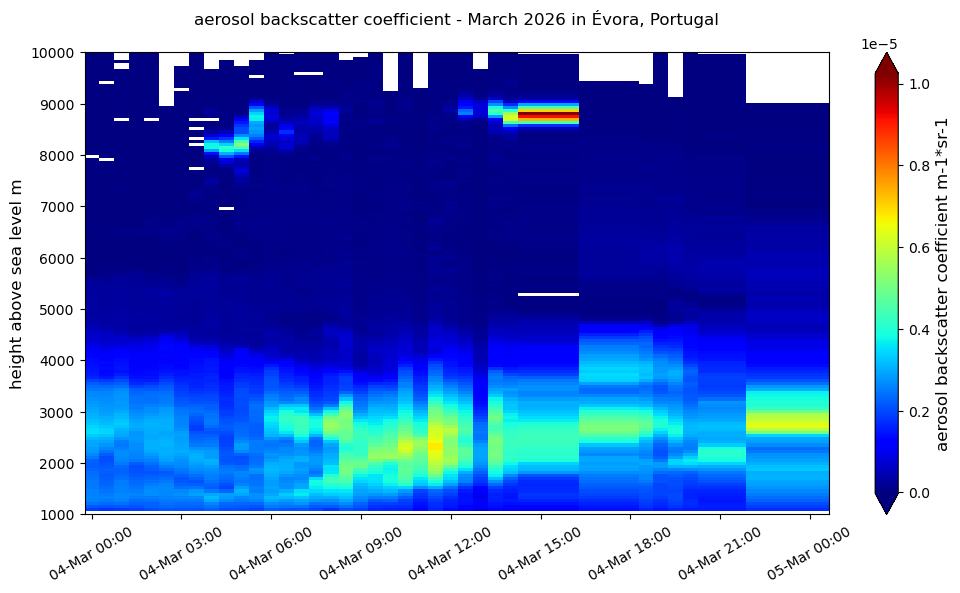
We can see the layer extending approximately from 1 km to 4 km with higher backscatter values between 06:00 and 12:00.
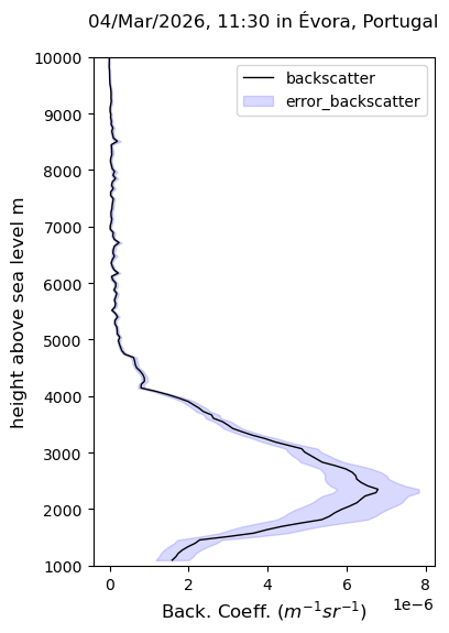
Below, let’s visualize the vertical variation of backscatter coefficient for a specific time using the selfunction of xarray library.
#Select the time of interest applying the sel function of xarray to our dataset
sel_earlinet = earlinet.sel(time="2026-03-04 11:30", method='nearest')
#the keyword method='nearest' allow select the nearest of 11:30 where the backscatter seems to be stronger
sel_earlinet#Let's plot our vertical profile along with error (note: we are working with level 1 data)
sel_bcks = sel_earlinet['backscatter'][0,:]
sel_errbcks = sel_earlinet['error_backscatter'][0,:]
# Create a matplotlib figure
fig = plt.figure(figsize=(4,6))
ax=plt.axes()
ax.plot(sel_bcks, sel_bcks['altitude'], '-k', linewidth=1, label='backscatter')

#Add title
ax.set_title('04/Mar/2026, 11:30 in Évora, Portugal', fontsize=12, pad=20)

#Add y-axis labels
ax.set_ylabel(sel_bcks.altitude.long_name + ' ' + sel_bcks.altitude.units, fontsize=12)

#Add x-axis labels
ax.set_xlabel('Back. Coeff. ($m^{-1} sr^{-1})$', fontsize=12)  #Another way to write labels

#Add limits to axes
ax.set_ylim(ymin=1000, ymax=10000)
#ax.set_xlim(xmin=0, xmax=7e-6)

#Add a shadow area of the error_backscatter
ax.fill_betweenx(sel_bcks['altitude'], sel_bcks-sel_errbcks, sel_bcks+sel_errbcks,
                 color='b', alpha=0.15, label='error_backscatter')

#Add legend
ax.legend()
Part 2 - Satellite data: Sentinel-5P
In this section we’ll use data from Copernicus Sentinel 5P satellite for an overview of dust spatial distribution. Specificaly, we’ll use Sentinel-5P Level 2 Aerosol Index also called the Absorbing Aerosol Index (AAI). The AAI is based on wavelength-dependent changes in Rayleigh scattering in the UV spectral range for a pair of wavelengths. When the AAI is positive, it indicates the presence of UV-absorbing aerosols like dust and smoke.
Search for data here
The sentinel-5P data file is in .nc format and well use the function open_dataset of the library xarray to open the .nc file.
With open_dataset, we use the keyword group = ‘PRODUCT’ to load the PRODUCT group. Note that if we do not specify this keyword, the Dataset appears empty only with references in attributes. This happens because these files are strutured with groups (like folders inside the file: PRODUCT - main geophysical data; METADATA - processing info).
Python libraries used:
xarray
matplolib
cartopy
s5p = xray.open_dataset('data/Sentinel_5P/S5P_OFFL_L2__AER_AI_20260304T115101_20260304T133231_43472_03_020901_20260306T015200.nc', group='PRODUCT')
s5pThe s5p data file contains measurements along the satellite orbit:
Along-track: scanline
Across-track: ground_pixel
And, as we can see above, the file has dimensions:
scanline
ground_pixel
time
corner
We can also see the different data variables contained in the file along with the respective dimensions. In the next cell, we’ll select the aerosol_index_340_380 to plot it in a map and to check how is the spatial distribution of aerosols.
lat  = s5p['latitude']
lon  = s5p['longitude']
uvai = s5p['aerosol_index_340_380']
qa   = s5p['qa_value']


# Apply QA filter: ignore data with qa_value < 0.5 using the function where of xarray.
# The locations where qa < 0.5 aer filled by NaN
uvai = uvai.where(qa > 0.5)
uvaiBelow, we’ll plot the uvai using the scatter function (plt.scatter(lon, lat, ...)) that plots each measurement exactly where it belongs geographically.
Sentinel-5P Level-2 data is not on a regular grid, it’s a satellite swath. This means that we have a curved strip of irregularly spaced points over the Earth instead of a regular lat/lon grid. Thus, pixels are not evenly spaced in lat/lon and the geometry changes across the swath.
The scatter works well handling with irregular spacing naturally and do not assumes a grid struture.
Note that when we run the cell for plotting with scatter function, it is a bit slow.
# Create a matplotlib figure
fig = plt.figure(figsize=(12,6))

#Axes projection
ax = plt.axes(projection=ccrs.PlateCarree())

#Plot figure with scatter plot
sc = ax.scatter(lon, lat, c=uvai, s=1, cmap='Spectral_r',
               transform=ccrs.PlateCarree())

#Add costline
ax.coastlines()

#Add colorbar and title
plt.colorbar(sc, label='Aerosol index')
plt.title(uvai.long_name + ', 2026-03-04')
plt.show()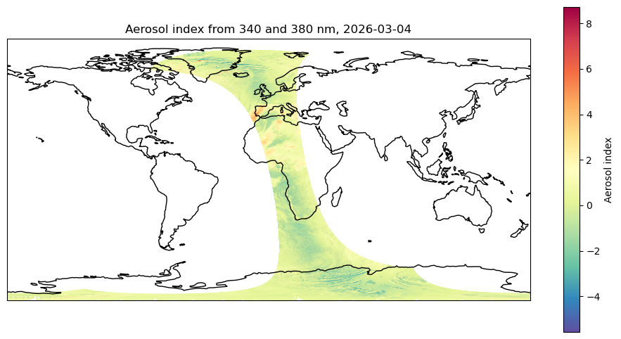
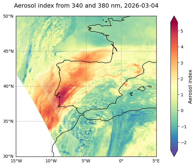
Let’s take a closer look of what happened in the Iberian Peninsula.
#Create a subset of Iberian Peninsula region

#Define max and min values for lat/lon
lat_min = 30
lat_max = 50
lon_min = -15
lon_max = 5

#Creates a mask
mask = ((lat >= lat_min) & (lat <= lat_max) & (lon >= lon_min) & (lon <= lon_max))

#Apply the mask to uvai and lat/lon using the function where.
#The keyword 'drop=True' means that #values outside lat/lon interval (False condition) are dropped from the result.
#To check, compare the size of uvai and uvai_IP DataArrays.

uvai_IP = uvai.where(mask, drop=True)
lat_IP = lat.where(mask, drop=True)
lon_IP = lon.where(mask, drop=True)

uvai_IP
# Create a matplotlib figure
fig = plt.figure(figsize=(12,6))
ax = plt.axes(projection=ccrs.PlateCarree())

#Format lat/lon gridlines
gl = ax.gridlines(crs=ccrs.PlateCarree(central_longitude=0, ),draw_labels=True,
                  linewidth=1, color='gray', alpha=0.5, linestyle='--')

gl.xlocator = mticker.FixedLocator([-15,  -10,  -5, 0, 5])
gl.ylocator = mticker.FixedLocator([30, 35, 40, 45, 50])
#To show labels coordinates only in bottom x-axis and left y-axis
gl.top_labels = False
gl.right_labels = False
gl.xformatter = LONGITUDE_FORMATTER
gl.yformatter = LATITUDE_FORMATTER
gl.xlabel_style = {'size': 10,'color': 'black'}#,'weight': 'bold'}
gl.ylabel_style = {'size': 10,'color': 'black'}#,'weight': 'bold'}

#Plot the data with scatter function
sc = ax.scatter(lon_IP, lat_IP, c=uvai_IP, s=1, cmap='Spectral_r',
               transform=ccrs.PlateCarree())


#Add costline
ax.coastlines('50m', color='black',linewidth=1.)

# Set the map bounds
ax.set_xlim(lon_min-0.05, lon_max+0.05)
ax.set_ylim(lat_min-0.05,lat_max+0.05)


#Add colorbar
cbar = plt.colorbar(sc, extend='both')
cbar.ax.set_ylabel('Aerosol index', fontsize=12)

#Add title
plt.title(uvai.long_name + ', 2026-03-04', fontsize=14, pad = 20)
plt.show()
____________________________________________________________________________________________________________________
This notebook was done under a researcher contract funded by Agenda Mobilizadora: New Space Portugal (C644936537-00000046). The work is also supported by national funds through FCT – Fundação para a Ciência e Tecnologia, I.P., in the framework of the UIDB/06107 – Centro de Investigação em Ciência e Tecnologia para o Sistema Terra e Energia.
